There was a time when web pages were structured with HTML tables. Today, we have flexbox and grid for that.
Tables still have a place. Tables are great for presenting tabular data, for providing information in columns and rows like in a spreadsheet.
Ways to start a Table Block
The first way to start a table is with the Block Inserter Icon  in the upper left corner. Click that icon, and select the Tab;e Block.
When you do not immediately see the Table Block, you can either browse the Block Explorer, or search for the block with the search form at the top of the explorer.
Alternatively, use the Block Inserter at the right side of a new paragraph. Same procedure here, when you don’t see the Tab;e Block, just search for it.

This inserter also pops-up between blocks, allowing you to insert a block before or after another block as via the ellipsis ( ) in the List View or the Block Toolbar.
The slash command offers the third option. Just type /table, at the beginning of a new paragraph.
| Team Member | Location | Job Title |
|---|---|---|
| Peter Petersen | Denmark | CEO |
| Jan Jansen | Netherlands | Marketing |
| Hans Heine | Germany | Programmer |
| Maurice Maître | France | Designer |
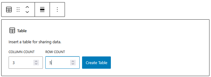
Is the table created, then you can start filling the table cells with data.
The Table Block provides alignment options for the entire table as well as columns.
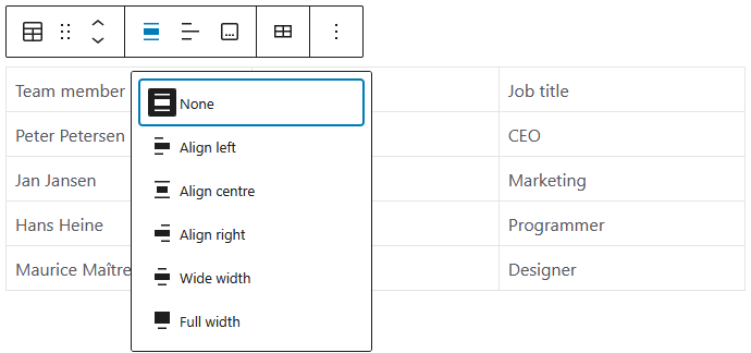
For aligning a table, you can choose from:
- None – default
- Left, Centre, Right – align the table within the content area of your time
- Wide width – make use of the site width of your theme
- Full width – presents the block screen wide
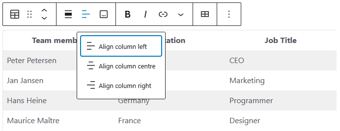
To align the data in the columns, you can choose from left, centre and right.
The data in the header row in the table above are centred because of the toggle the Header section is switched on in the Settings Panel
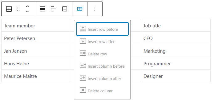
Like everything, data change, so besides to updating the data in a cell, you can also add and remove rows and columns.
Settings Panel
The most common options of the block are handled through the Block Tool Bar.
Additional features, however, are available in the right sidebar. To get there, click the sidebar icon  , directly left from the Publish/Save-button.
Here you have additional options for text and background colours, and typography.
The Table Block comes with additional options in the Settings Panel.
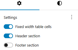
By default, the column widths adapt to the data in the column. When you prefer the columns to be equal width, just toggle the Fixed width table cells option.
Advanced Settings
Blocks also offer fields where you can enter an HTML anchor and one or more CSS classes. Read about these features in Advanced Sidebar Settings of a Block.
The HTML of the Table Block
<figure class="wp-block-table is-style-stripes">
<table class="has-fixed-layout">
  <thead>
    <tr>
      <th>Team member</th>
      <th>Location</th>
      <th>Job Title</th>
    </tr>
  </thead>
  <tbody>
    <tr>
      <td>Peter Petersen</td>
      <td>Denmark</td>
      <td>CEO</td>
    </tr>
    <tr>
      <td>Jan Jansen</td>
      <td>Netherlands</td>
      <td>Marketing</td>
    </tr>
    <tr>
      <td>Hans Heine</td>
      <td>Germany</td>
      <td>Programmer</td>
    </tr>
    <tr>
      <td>Maurice Maître</td>
      <td>France</td>
      <td>Designer</td>
    </tr>
  </tbody>
</table>
</figure>
In the HTML <table> above, the header is defined by the <thead>element. The data is presented in the table body with the <tbody> element.
Further we can distinguish table rows <tr> and the table data <td> in the table cells.
The Table Block is enclosed in the HTML <figure> element, just like the Pullquote Block. This allows additional styling options, just like the wp-block-table class.
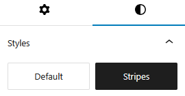
In the Settings Panel, I opted for the style Stripes. This brings the class is-style-stripes to the table. Instead of the default grey, I applied the theme colour #EFEBED.
For light green zebra stripes, add this CSS to your theme:
.wp-block-table.is-style-stripes tbody tr:nth-child(2n+1) {
    background-color: #98DB92;
}