The Details Block shows only a summary and a button. Clicking either will open the block and reveal the content.
To be, or not to be?
Yes, indeed that is still the question.
The phrase “to be or not to be” originates from William Shakespeare’s play Hamlet, written around 1599–1601. It is the opening line of a famous monologue spoken by the titular character, Prince Hamlet, in Act 3, Scene 1. In this speech, Hamlet contemplates the merits of life versus death and whether to endure his suffering or end it.
A popular application of a number of these blocks are accordions for FAQs; Frequently Ask Questions.
Ways to create a Details Block
The first way to start a heading is with the Block Inserter Icon  in the upper left corner. Click that icon, and select the Details Block.
When you do not immediately see the Details Block, you can either browse the Block Explorer, or search for the block with the search form at the top of the explorer.
Another option is the Block Inserter at the right side of a new paragraph. Same procedure here, when you don’t see the Details Block, just search for it.
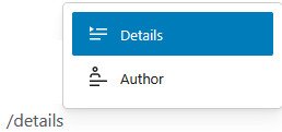
Another option is typing /details, at the beginning of a new paragraph. Note that the Author Block is not a special version of the Details Block, it inserts an Author Block.
The last option is transforming a paragraph into a Details Block. Hover over the paragraph, click the paragraph icon, the first icon at the left, and select Details.
The Block Toolbar of the Details Block
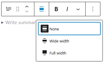
The Block Toolbar of the Details Block offers most of the usual features of the Block Toolbar. The alignment tool deserves a little more attention here.
The alignment tool has two options:
- None – the default state, relative to the content area
- Wide width – which aligns relative to the layout width of the website
- Full width – aligns relative to the width of the users’ screen
Settings Panel
The most common options of the block are handled through the Block Tool Bar.
Additional features, however, are available in the right sidebar. To get there, click the sidebar icon  , directly left from the Publish/Save-button.
Here you have additional options for text and background colours, and typography.
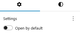
The Details Block has an optional setting in the Settings Panel. For each Details Block you can decide whether or not to open it by default.
When there are more details blocks, like in an FAQ, this give you the opportunity to open the first one – or the most important one – upon loading the page.
Advanced Settings
Blocks also offer fields where you can enter an HTML anchor and one or more CSS classes. Read about these features in Advanced Sidebar Settings of a Block.
The HTML of the Details Block
<details class="wp-block-details"><summary>To be, or not to be?</summary>
<p>Yes, indeed that is still the question.</p>
<p>The phrase "to be or not to be" originates from William Shakespeare's play Hamlet, written around 1599–1601. It is the opening line of a famous monologue spoken by the titular character, Prince Hamlet, in Act 3, Scene 1. In this speech, Hamlet contemplates the merits of life versus death and whether to endure his suffering or end it.</p>
</details>
The Details Block features two special HTML elements. The <details> element creates a disclosure container, while the <summary> element provides the label.
The Gutenberg editor add the CSS class wp-block-details for styling options.